(animation) 물결 애니메이션
2023-02-22
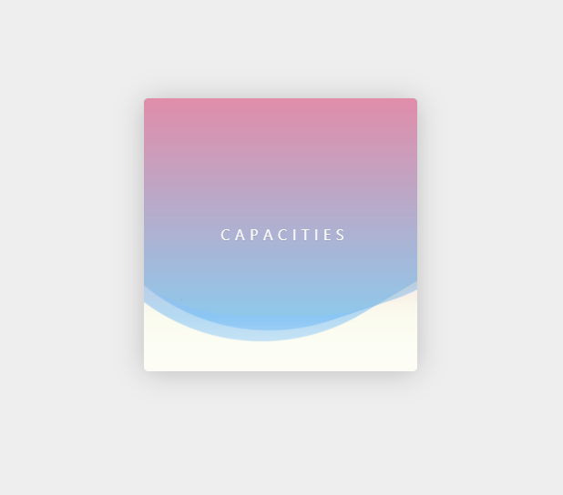
물결 애니메이션
HTML
<!DOCTYPE html>
<html lang="en">
<head>
    <meta charset="UTF-8">
    <meta http-equiv="X-UA-Compatible" content="IE=edge">
    <meta name="viewport" content="width=device-width, initial-scale=1.0">
    <link rel = "stylesheet" href = "style.css"/>
    <title>Document</title>
</head>
<body>
    <div class="box">
        <div class="wave -one"></div>
        <div class="wave -two"></div>
        <div class="wave -three"></div>
        <div class="title">C a p a c i t i e s</div>
    </div>
</body>
</html>
먼저 간단히 물결 애니메이션을 구현할 부분인 작은 박스를 만들어 줍니다. 그 후 물결을 표현해줄 div 박스 3개를 만들고 css로 border-radius를 줘서 둥글게 만들고 각각 다른 시간으로 돌아가게 만들어줄 것입니다.
이 애니메이션은 거의 css이기 때문에 css에서 더 자세한 설명을 하겠습니다.
CSS
html, body {
    height: 100%;
}

html {
    background: #eee;
}

body { /* 물결 애니메이션 박스 가운데로 보내기 */
    display: flex;
    justify-content: center;
    align-items: center;
}
가장 먼저 html, body에 초기 셋팅을 하고 박스를 가운데로 보내줍니다.
그 뒤로 박스 스타일을 해줍시다. 스타일링 해주면서 중요한 부분은 position을 relative로 해서 자식 태그들의 position이 absolute일 때 박스를 기준으로 하도록 해줍니다.
.box { /* 박스 설정 */
    width: 300px;
    height: 300px;
    border-radius: 5px;
    box-shadow: 0 2px 30px rgba(0, 0, 0, 0.2);
    background: #fbfcee;
    position: relative;
    overflow: hidden;
    transform: translate3d(0, 0, 0);
}
다음으로는 공통적인 물결 div를 스타일링 해줍니다.
.wave {
    opacity: 0.4;
    position: absolute;
    left: 50%;
    background: #0af;
    width: 500px;
    height: 500px;
    margin-left: -250px;
    margin-top: -250px;
    border-radius: 43%;
    animation: drift 3000ms infinite linear;
}
크기를 box보다 200px 더 큰 정사각형으로 만든 후 wave를 absolute로 준 후 왼쪽으로 50% 밀고 다시 margin-left와 margin-top을 이용해 가운데로 배치해줍니다. 마지막으로 border-radius로 둥글게 만들고 나중에 key frame으로 적용해줄 애니메이션을 넣어줍니다.
이제 2개의 wave를 나눠서 각기 다른 속도로 회전을 하도록 만들어 줍니다.
.wave.-three {
    animation: drift 5000ms infinite linear;
}

.wave.-two {
    animation: drift 7000ms infinite linear;
    opacity: 0.1;
    background: yellow;
}
마지막으로 keyframes를 정의해줍니다.
@keyframes drift {
    from {
        transform: rotate(0deg);
    }
    to {
        transform: rotate(360deg);
    }
}
0에서 360까지 돌아가게 하면 끝입니다.
다음은 최종으로 부가적으로 스타일링 해준 결과 코드입니다. 이 부분은 기능적으로는 안하셔도 문제 없습니다.
.box:after {
    content: "";
    display: block;
    left: 0;
    top: 0;
    width: 100%;
    height: 100%;
    background: linear-gradient(
        to bottom,
        #ee88aa,
        rgba(221, 238, 255, 0) 80%,
        rgba(255, 255, 255, 0.5));
    z-index: 11;
    transform: translate3d(0, 0, 0);
}

.title {
    position: absolute;
    left: 0;
    top: 0;
    width: 100%;
    z-index: 1;
    line-height: 300px;
    text-align: center;
    transform: translate3d(0, 0, 0);
    color: white;
    text-transform: uppercase;
    text-shadow: 0 1px 0 rgba(0, 0, 0, 0.1);
    text-indent: 0.3em;
}
